
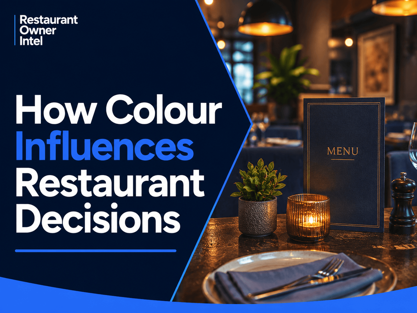
How Colour Influences Restaurant Decisions - And What Owners Should Do About It
Discover how colour influences restaurant decisions, from menu choices and food perception to branding, lighting and customer experience, with practical advice for restaurant owners.
Customers start making decisions about your restaurant long before they taste the food. They see your sign. They look through your website. They scroll past photographs on Google or Instagram. They walk into the dining room. They pick up the menu. At every stage, colour is helping to create an impression. That is why understanding how colour influences restaurant decisions is more useful than simply choosing colours because they look attractive. Colour can affect what customers notice, what they associate with a dish, how appealing food appears and how they feel about the environment around them. For restaurant owners, the important question is not “What is the best colour for a restaurant?” It is: “Are the colours we use helping customers make the decisions we want them to make?” Colour Is Part of the Customer ExperienceRestaurant owners regularly invest in menu design, photography, signage, lighting and décor. Colour runs through all of them. Research into restaurant interiors has found links between colour, emotional response and customers' decisions about entering a restaurant. Other research has shown that background colour can affect perceptions of food and drink, while more recent hospitality research suggests warm and cool colours can produce different perceptions of food. The lesson is not that painting a wall red will suddenly increase sales. Colour psychology is more complicated than that. The practical lesson is that colour provides customers with cues, and those cues can support — or undermine — the experience you are trying to sell. 1. Your Colours Set Expectations Before Customers OrderThink about two restaurants. One uses deep navy, dark wood, muted lighting and restrained gold details. Another uses bright yellow, white walls, bold menu boards and strong lighting. Before seeing the prices, you would probably expect different experiences. That matters. Customers use visual cues to form expectations about whether a restaurant feels premium, casual, traditional, modern, healthy, energetic or relaxed. Your colour choices therefore need to match your positioning. A restaurant charging premium prices may struggle if its branding and interior feel cheap or dated. Equally, a quick-service concept can create unnecessary friction if its visual identity makes the business look formal or intimidating. Owner takeaway: Look at your restaurant without considering what you know about the business. What do the colours tell a first-time customer to expect? 2. Warm and Cool Colours Can Change How Food Is PerceivedThere is good reason to be careful with simplistic claims such as "red makes people hungry." Research into colour and appetite is more nuanced than many marketing articles suggest. A 2025 hospitality study found that warmer-coloured food images were associated more strongly with tastiness, while cooler-coloured images enhanced perceptions of healthiness. That has practical implications for restaurant marketing. If you are promoting an indulgent burger, steak, pizza or dessert, warm tones in the photography and surrounding design may reinforce the message you want to communicate. If you are promoting salads, fresh bowls or another health-focused offer, cooler or fresher visual cues may support a different perception. The important point is congruence. Your colours should support what you are trying to sell. 3. Colour Can Direct Attention on Your MenuColour also has a much simpler job: attracting attention. This is particularly useful on a restaurant menu. If everything on the page is black, one restrained blue box will stand out. If every dish has a different colour, nothing stands out. Restaurant owners can use colour selectively to draw attention towards:
The mistake is turning the menu into a collection of competing colours, boxes, photographs, icons and labels. Customers still need to be able to scan it quickly. Example: If a signature £24 dish produces a better contribution margin than neighbouring choices, a subtle colour treatment around that item may help it attract attention without an aggressive "BUY THIS" message. Colour should guide the eye, not fight for it. 4. The Colour Around Food Matters TooRestaurant owners naturally concentrate on the food itself when reviewing photography or presentation. But the colours surrounding it matter. Research reviewed by Oxford experimental psychologist Charles Spence found evidence that background colour — including plateware and the wider context in which food is presented — can influence food perception and behaviour. Think about contrast. A pale dish on a pale plate can disappear visually. A colourful dish against suitable plateware may appear more distinctive. The same principle applies to photography. The table, plate, napkin, background and surrounding props all affect the customer's perception of the dish. This matters particularly online, where your food may have less than a second to catch someone's attention while they scroll. Owner takeaway: Review your ten most important food photographs as thumbnails on a phone. Does the food immediately stand out? 5. Lighting Can Help — Or Hurt — Your FoodColour does not only come from paint and graphics. Lighting changes it too. Research conducted in a restaurant-like environment found that vivid coloured lighting could affect appetite evaluations, particularly when the lighting altered the natural colour balance of food. This should concern any restaurant that has invested heavily in atmospheric lighting. The dining room might look impressive while the food underneath the lights looks considerably less appealing. A steak should still look like a steak. Fresh vegetables should still look fresh. Desserts should photograph well when a customer takes out a phone. Before changing restaurant lighting, put actual dishes on the tables and look at them from a customer's seat. Better still, photograph them with a normal smartphone. You may see something very different from what your lighting designer sees in an empty dining room. 6. Consistency Builds RecognitionColour also plays a branding role. Imagine someone discovers your restaurant through Instagram. They click through to your website, find you on Google and eventually arrive outside. Those touchpoints should feel like the same business. If your social graphics use one visual style, your website another, your menus another and your exterior signage another, you lose some of that recognition. Independent restaurants do not need complicated brand manuals. They do need consistency. Choose a small core palette and use it repeatedly across:
Consistency makes a restaurant look more considered and makes the brand easier to recognise. 7. Do Not Choose Colours From Psychology Charts AloneSearch for colour psychology and you will quickly find charts telling you: Red = hunger. Blue = trust. Green = health. Yellow = happiness. Treat these as broad associations, not operating instructions. Research into colour and appetite does not support the idea that one colour produces the same predictable response in every situation. For example, research into red and blue food colouring has produced inconsistent appetite effects. Context matters. Culture matters. The food matters. Lighting matters. Contrast matters. Your restaurant concept matters. And the combination of colours matters. A neighbourhood Italian restaurant, sushi bar, premium steakhouse and plant-based café should not all use the same palette simply because somebody claims one colour "increases appetite." Start with the experience you want customers to have, then choose colours that reinforce it. How Colour Influences Restaurant Decisions: A 10-Minute AuditLook at your restaurant through the customer's eyes. Ask:
You do not need to redesign everything because one answer is "no." Find the biggest mismatch first. Small Colour Changes Can Have a Commercial PurposeColour alone will not rescue a weak restaurant, fix poor service or turn an unprofitable menu item into a bestseller. But that does not make it unimportant. Customers make dozens of small judgements throughout the restaurant journey. Does this place look right for me? Does that dish look good? What should I order? Does this feel worth the price? Would I come back here? Colour forms part of the environment in which those decisions happen. The opportunity for restaurant owners is therefore not to search for a magic colour. It is to make sure the colours customers see are supporting the decisions you want them to make. One Action to Take This WeekChoose one customer touchpoint: your menu, website, Google photos, dining room, signage or social media. Review the colours from a customer's perspective. Ask one question: “What is this colour helping the customer notice, feel or decide?” If you cannot answer it, there may be an opportunity to improve it. |
Restaurant Owner Resource |
Free AI Restaurant Growth Plan |
Curious what growth opportunities your restaurant might be missing? Our free AI-powered Growth Plan analyses your restaurant's online presence, marketing and growth goals to identify opportunities you may not have considered.
|
Oct 19, 2026
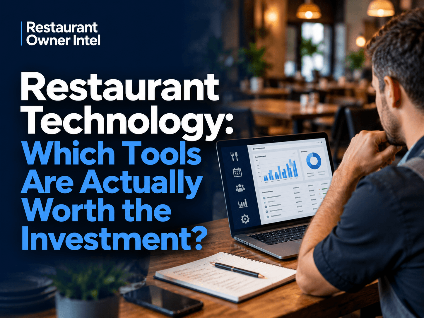
Restaurant Technology: Which Tools Are Actually Worth the Investment?
From POS systems and booking software to AI and staff scheduling, here's how to choose restaurant technology that earns its place in your budget, protects your margins and makes running your business easier.

Oct 18, 2026
How to Fill Quiet Restaurant Nights Without Offering Discounts
Empty tables on a Tuesday or Wednesday can be expensive. But cutting prices isn't the only way to bring customers through the door. These practical restaurant marketing ideas can help you increase midweek bookings, give diners a reason to visit and protect your profit margins.

Oct 18, 2026
Are Delivery Apps Bringing You Sales or Taking Too Much Margin?
Delivery apps can keep your kitchen busy and your sales figures climbing. But how much of that money are you actually keeping? Here's how to uncover the real cost of restaurant delivery apps, protect your profit margins and make every order work harder for your business.

Oct 17, 2026
Why Customers Choose One Restaurant Over Another (And How to Win Their Business)
Why Customers Choose One Restaurant Over Another comes down to more than food and price. Understanding the psychology behind dining decisions can help your restaurant attract more customers, win bookings and build repeat business.
0 Comments
Join the conversation
Be the first to comment
Share your thoughts above.