Too Many Choices Could Be Costing Your Restaurant Bookings
Restaurant mobile website friction can cost potential bookings. Learn how to reduce unnecessary choices and create a clearer path from interest to reservation.
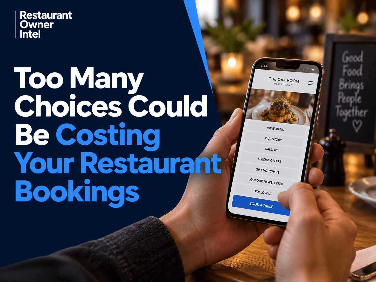
A customer is sitting on the sofa at 7pm looking for somewhere to eat on Saturday night. They've already seen your restaurant on Google or Instagram. They like the look of the food. The location works. They've tapped through to your website. At this point, the job of your website is surprisingly simple. Help them book. Yet many restaurant websites make the customer do something else first. They present a collection of choices. View our menus. None of those options is necessarily bad. The problem is that they're all competing for attention at the exact moment the restaurant has something valuable: a potential customer with booking intent. Restaurant owners often think about website friction as a technical problem. A slow website creates friction. A broken booking button creates friction. A page that doesn't display properly on mobile creates friction. All true. But there's another form of friction that's easier to miss because nothing appears to be broken. Decision friction. The website works perfectly. It simply makes the customer think more than they need to. And when someone has already decided what they want to do, more choice isn't necessarily better service. Separate information from decisionsThere's a useful distinction restaurant owners can make when reviewing their mobile website: Customers may need access to lots of information. They don't need to make lots of decisions. Those are two different things. Your website might legitimately need to contain menus, allergen information, opening hours, directions, private dining details, gift vouchers, photographs, contact information, social links and information about special events. Removing useful information isn't the goal. The question is whether all of those things deserve equal prominence when someone arrives with a specific intention. Imagine walking into a restaurant and saying to the host: "I'd like a table for four on Saturday." Instead of helping you make the reservation, the host replies: "Of course. Would you like to see our lunch menu first? Or perhaps look at some photographs of the dining room? You can also join our mailing list. We sell gift vouchers too. Would you like our Instagram account? Or would you prefer to contact us?" It's an exaggerated example, but it exposes the problem. The customer has already told you what they want. A good host reduces the distance between that intention and the outcome. Your mobile website should do the same. This gives restaurant owners a simple way to evaluate website choices: Information supports an intention. Decisions interrupt an intention. A menu link can support a customer who wants to check whether there's something they'll enjoy before booking. A prominent newsletter pop-up can interrupt them. Opening hours can support the decision. A row of social media icons can redirect it. Photographs can create confidence. Making someone navigate through a gallery before finding the reservation button creates another task. The distinction isn't about whether a website feature is useful in general. It's about whether it's useful at this particular point in the customer's journey. That's where many websites go wrong. They're organised around everything the restaurant wants to show rather than what the customer is most likely trying to accomplish. Look for competing decisions, not just missing buttonsConsider two restaurant mobile homepages. Restaurant A opens with a large photograph and the restaurant name. Underneath are buttons for: Menu A promotional box then appears offering 10% off a customer's next visit if they join the mailing list. There's nothing obviously wrong with the site. In fact, it might look excellent. But imagine our Saturday-night customer using it. They've arrived wanting a table. First, they scan the page to work out where to go. They notice "What's On" and wonder whether there's an event that night. They see "Menu" and decide they should probably check it. They return to the homepage. The mailing-list box appears. They close it. They scroll again and eventually reach "Book." The restaurant hasn't prevented the booking. It has simply introduced several opportunities for the original intention to weaken. Now consider Restaurant B. The first mobile screen gives the customer three obvious pieces of information:
Opening information is easy to find immediately below. Directions, private dining, vouchers, gallery, contact details and everything else remain available further down the page or through the navigation. Restaurant B hasn't necessarily removed anything. It has established a hierarchy. That's the deeper lesson. Reducing booking friction doesn't mean having fewer things on your website. It means asking fewer things of the customer before the booking. That distinction matters because restaurant owners can otherwise respond to conversion problems by stripping useful content from the site. That's not the objective. The objective is to protect the customer's intention. Think of booking intent as something that can be strong, moderate or fragile. Someone searching specifically for your restaurant and tapping "Book" may have strong intent. Someone comparing three local restaurants for dinner may have much weaker intent. The second customer is especially important. They aren't necessarily going to fight through a confusing website because they've committed to eating with you. They can go back to Google, open the next restaurant and continue looking. Your website shouldn't require commitment before it makes committing easy. Audit the path, not the homepageA useful website review therefore starts with an intention rather than a design opinion. Don't open your homepage and ask: "Does this look good?" Choose a customer goal and ask: "How many decisions does this person have to make before they can complete what they came here to do?" For booking, start where a real customer might start. Open your restaurant website on your phone. Don't use your knowledge of the website. Pretend you don't know where anything is. Now give yourself one task: Book a table for four this Saturday at 7:30pm. Follow the journey. At each stage, notice every moment where you have to stop and decide what to do next.
You're looking for what might be called decision points. Some decision points are necessary. The customer has to choose the number of guests. They have to choose a date. They may need to choose an available time. Those decisions move the booking forward. Other decisions don't. Should I look at Instagram? Should I read the About page? Should I close this promotion? Should I click Reservations or Contact? Should I use the booking form or call? Should I look at the menu before continuing? These are competing decisions. They consume attention without necessarily advancing the customer's original goal. That gives you a practical rule for deciding what deserves prominence: If a choice advances the booking, make it easy. If it competes with the booking, make it secondary. This doesn't mean hiding your menu or abandoning email marketing. It means respecting timing. A mailing-list invitation presented after someone has completed a reservation is very different from a mailing-list pop-up covering the booking button when they arrive. A link to Instagram in the footer is very different from making Instagram one of four equally prominent calls to action beside "Book a Table." A private dining page is valuable to someone organising a party. It doesn't need to compete for attention with the main booking action of someone looking for dinner tonight. This is where website design becomes less about aesthetics and more about commercial judgment. Every element is effectively being given a priority. The mistake is pretending it isn't. Button size gives priority. Screen position gives priority. Colour gives priority. Repeated calls to action give priority. Pop-ups give priority. Navigation order gives priority. If eight different actions are presented with roughly equal visual importance, you've made the customer establish the hierarchy for you. That's work the restaurant could have done. There is also a useful implication beyond the homepage. Run the same test from wherever customers actually enter your website. Someone might arrive from your Google Business Profile looking for a table tonight. Another might tap a link from an Instagram post about your Sunday roast. Someone else may receive your website in a WhatsApp message from a friend. Their first page isn't always your homepage. So ask the same question on your menu page, event pages and other common landing pages: If this page creates booking intent, is the next action obvious? A customer might open your menu with no intention of booking, see exactly what they want and become ready to reserve. At that moment, don't make them navigate backwards to find out how. The booking route should become easier as intent increases, not harder. That is the real standard. Don't judge your mobile website by how much information it contains or how impressive the homepage looks. Judge it by how well it recognises what a customer is trying to do and gets out of their way. Open your website on your phone today and attempt one real booking without using your existing knowledge of the site. Count every decision you're forced to make between arrival and reservation. Then apply one rule to each: Does this decision move the customer closer to a table, or merely give them another place to go? The second category is where your booking friction is hiding. Try This With AIUse the AI you're already using: ChatGPT, Claude, Gemini, Grok, Meta AI, Copilot, or another general-purpose AI assistant. Replace the example information inside the brackets with your own information, then copy and paste the complete prompt into your AI. AI PromptAct as a restaurant website conversion specialist and audit my mobile booking journey for decision friction. Use the information I provide to identify every decision a potential customer encounters between arriving on the website and starting or completing a table booking, then separate those decisions into two categories: decisions that genuinely move the booking forward and competing decisions that consume attention, redirect the customer, create uncertainty, or unnecessarily delay the booking. Pay particular attention to competing calls to action, navigation choices, pop-ups, menus, galleries, offers, newsletter sign-ups, social links, contact options, unclear button wording, multiple reservation routes, and anything given visual or positional priority over booking. Rank the five most important sources of booking friction, explain specifically why each could interfere with a customer who already wants a table, and recommend the simplest practical change for each without removing useful information customers may still need. Finish by showing me what the ideal priority order should be for the mobile journey and give me a clear verdict using this rule: if a choice advances the booking, make it easy; if it competes with the booking, make it secondary. Don't invent details I haven't supplied. Clearly label any reasonable inference as an inference. [Paste or describe your mobile website journey here, for example: “The homepage opens with a full-screen food photo and a Menu button. Below that are Our Story, Gallery, Offers and Book a Table. A newsletter pop-up appears after a few seconds. The navigation has Menu, Events, Gift Vouchers, Contact and Reservations. Clicking Reservations opens a page explaining our booking policy before another Book Now button takes customers to our external reservation system.”] |
Restaurant Owner Resource |
Free AI Restaurant Growth Plan |
Curious what growth opportunities your restaurant might be missing? Our free AI-powered Growth Plan analyses your restaurant's online presence, marketing and growth goals to identify opportunities you may not have considered.
|
Oct 19, 2026
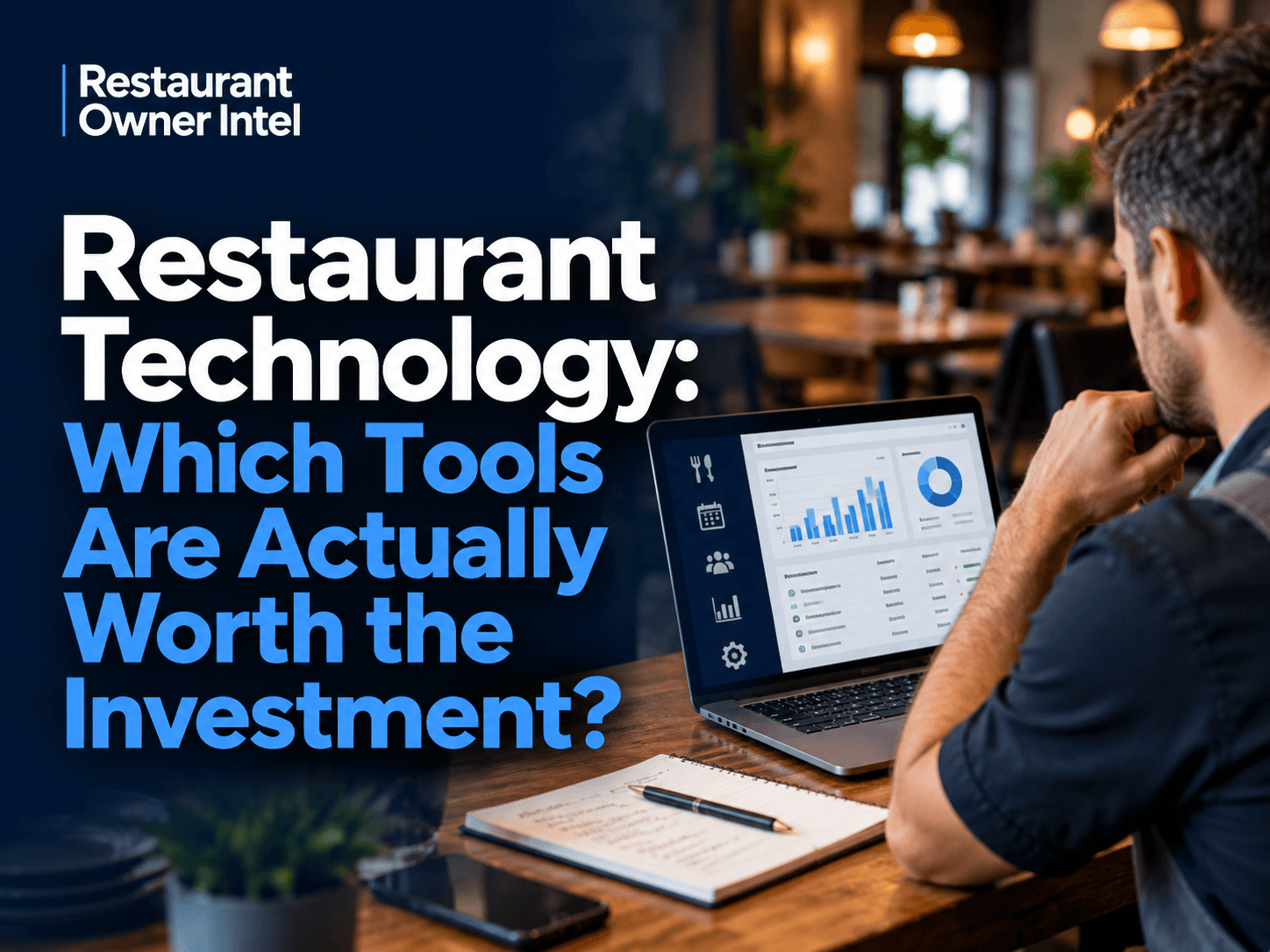
Restaurant Technology: Which Tools Are Actually Worth the Investment?
From POS systems and booking software to AI and staff scheduling, here's how to choose restaurant technology that earns its place in your budget, protects your margins and makes running your business easier.
Oct 18, 2026
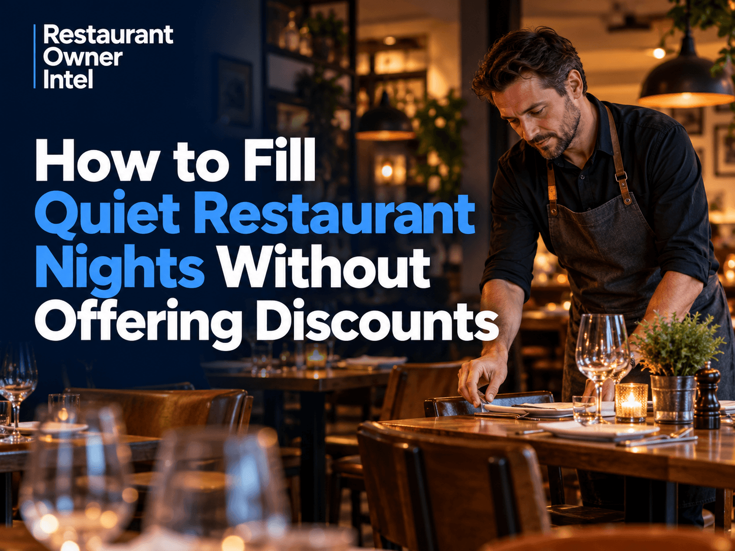
How to Fill Quiet Restaurant Nights Without Offering Discounts
Empty tables on a Tuesday or Wednesday can be expensive. But cutting prices isn't the only way to bring customers through the door. These practical restaurant marketing ideas can help you increase midweek bookings, give diners a reason to visit and protect your profit margins.

Oct 18, 2026
Are Delivery Apps Bringing You Sales or Taking Too Much Margin?
Delivery apps can keep your kitchen busy and your sales figures climbing. But how much of that money are you actually keeping? Here's how to uncover the real cost of restaurant delivery apps, protect your profit margins and make every order work harder for your business.
Oct 17, 2026
Why Customers Choose One Restaurant Over Another (And How to Win Their Business)
Why Customers Choose One Restaurant Over Another comes down to more than food and price. Understanding the psychology behind dining decisions can help your restaurant attract more customers, win bookings and build repeat business.
0 Comments
Join the conversation
Be the first to comment
Share your thoughts above.